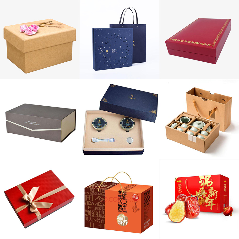
Determine the color of creative packaging design based on the nature of the product.
For example, most foods choose warm colors to stimulate appetite.
The light color makes the food look very hygienic.
The color of packaging design should also pay attention to the following points in practical application:
1. Commerciality
This is a difference from the use of colors in general painting.
All types of goods have certain common attributes.
There are significant attribute differences between medical and entertainment products, food and hardware products, cosmetic products, and cultural and educational products.
2. Advertising
Due to the abundance of product varieties and the increasingly fierce market competition, the visual expression of sales packaging is becoming increasingly important in advertising, among which color processing is of course an important aspect.
3. Uniqueness
① Specific color
Some colors in packaging design should have been matched according to their attributes, but in this way, the color of the picture becomes mediocre. Designers often go against the trend and use unconventional colors to make their product packaging stand out from similar products. This color treatment makes us visually more sensitive and memorable.
② Popular colors
Popular colors are colors that are in line with the trend of the times, and are immediately fashionable and trendy.
It is the information of product designers and the signal of international trade dissemination.
4. Ethnicity
The psychological changes generated by color vision are very complex, and they vary depending on era, region, or individual judgment.
Various ethnic groups have formed different color customs due to their social background, economic conditions, living conditions, traditional customs, customs, and natural environment.
Therefore, color is quite important in creative packaging design.

Please sign in to comment
register